GlobeWater & Solar’s Website Redesign
Timeline - May-December 2023
My Role - UX/UI Designer and consultant
The Problem - The original website needed an entire design improvement for increased traffic and revenue
I was very excited to redesign Ms. Colella’s new website. I have known her since my first internship out of community college, where I helped support her father’s business and then began to help her orchestrate and organize her own afterwards.
It was an honor again to work alongside her and her newfound team after the many years apart.
Challenges to Success
To collaborate with Ms. Colella and her entire team to ensure of the websites success when it came to understanding the product at hand and redesigning the respected pages for better user engagement.
I was included on multiple team meetings with other designers and her own engineers. These insightful meetings gave me a much needed UX/UI Design refresher.
Tools I Used


The Solution - Redesigning and improving her existing website to bring in user engagement
The Process

Color & Imagery
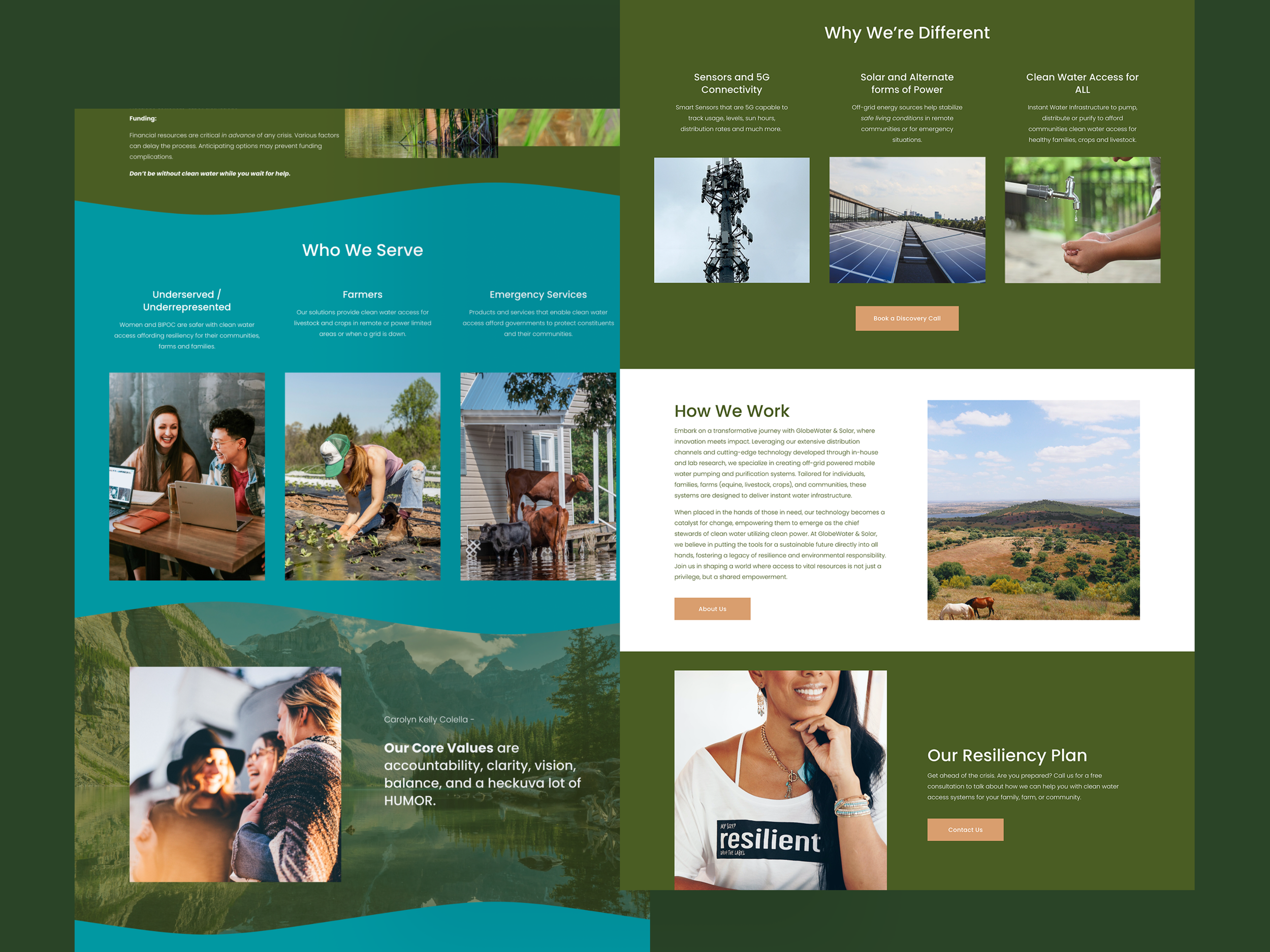
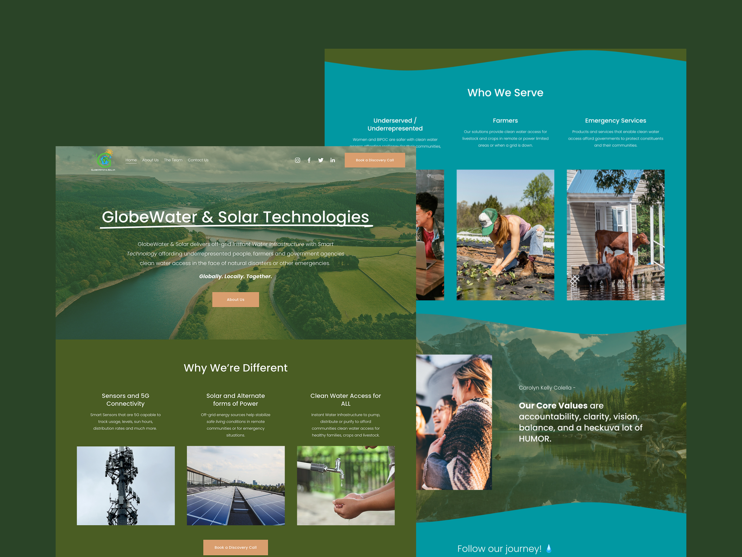
Since my clients company is environmental and sustainable, we went with an earth tone palette and simple text without many curves. She expressed that she enjoyed the mossy green I picked out as well as the teal to compliment her product which filters water for people in need. I even added a wave design on some of the pages as an accent to highlight this.
For the imagery I chose mountain scenes with bodies of water and women, since that is also a main component with her business.
Empowering women everywhere is what is key to her.

Must Have Elements
My client and I discussed various items to include on each respected page. Since she was involved in a service that gave water to people in need, we decided on having:
A booking/scheduling button to have clients tell her specifically what they needed with a personable 1-on-1.
A FAQ with most common questions she’s obtained about her product.
Who benefits her service the most.
To how her product is different than the rest.

The Interviews
My client had given out multiple surveys and had in person interviews with many connections she had made on the journey of her entrepreneurship. These questions stemmed from:
How to combat with the rise in climate change.
How does it affect women and especially someone of color in a disaster situation where water is needed? (example Flint Michigan)
How do farmers cope especially with horses to manage when disaster strikes?
What does the person do when they are met with the force of hurricanes, tornadoes, earthquakes, wildfires, and other hazards. What is their backup plan if all else fails to have clean water?
I kept these results in mind with the redesign of her website. We really wanted to appeal to the minority that would benefit greatly from her product.
Creating a User Journey Map
With the results provided by the interviews my client had given out, I decided to make a user journey map by creating someone who could benefit their service.
The steps are awareness, consideration, acquisition, service and then loyalty.
What are the steps? What are they thinking and doing? What are the presented pain points of the process of being a new customer and the feelings that come with it?
The Site’s Design Before
Her site before was very minimal with not much imagery and just a lot of white pages with static text on them. Most of the pain points before were the small neon navigation to the lack of CTA’s on the site to direct the user where to go. I felt like at the time the design did not truly capture what her business was at heart.
The Site’s Design After
The final product achieved the overall aesthetic a sustainable and environmental company would have. The mossy green primary color balanced well with the beige CTA’s as well as the gorgeous scenic shots I found on Unsplash. The layout is easy to navigate and the pages work in unity together instead of against one another.
The Why We’re Different keeps my client apart from the rest by showcasing what her company does for those in need of clean water.
How We Work demonstrates the process that goes into filtering clean water with solar panel technology.
To her Resilience Plan as well as and About Page to further give the viewer more information about her mission at hand.
All of this was lacking on her main website from before, which in hindsight negatively impacted her company in many ways more than one.
Visual hierarchy can really make or break any website.
Looking At The Future
Overall, I was very excited to tackle and completely reinvent her website and give it some proper TLC. Not just for her business, but to help the woman who I have been in touch with all of these years who has always given me opportunities to grow; personally and professionally.
It was very fun to collaborate alongside with her to bringing her vision to life. I just know this new website will showcase her business beautifully and bring in more clientele her way! ❤️
“This is beautiful! The images and text immediately draw me in. I love the messaging. Nice work!” — Christa Downey, Team Member