Meetify - Discord’s Scheduling Website and App for Season 3 of Aimset
Timeline - January-April 2024
My Role - Style Guide Designer, UX Researcher, Main Contributor to Team Lead Felisha Alexander, Project Organizer
The Beginning
I was invited to a Discord server through LinkedIn to collaborate and apply to a role to take lead on a new project that was brewing in the works. I applied to the contributor position and was accepted.
The project was originally called Whencanwemeet, but after discussion with my new team about the direction of the project and the name being too lengthy, we decided on Meetify after a poll to simplify things.
Challenges to Success
Discord was lacking the connection with its users to connect via polls, meetings, and surveys for professionals and friends alike. With the various time zones this could be challenging especially for say Twitch streamers.
We gathered information of other meeting platforms and identified their strengths and weaknesses to implement moving forward.
What key features do they have?
How do they implement meetings successfully?
What are their design choices?
How easily can the user navigate their red routes?
How can we integrate it seamlessly with Discords design?

Meetify’s competitors and what they brought or didn’t bring to the table relating to success and design.
The Solution - Designing a platform to allow Discord users to connect via meetings with multiple engaging features.
The Competition - My team and I researched various meeting platforms and compiled a list of their strengths and weaknesses. We used what we liked to implement for our idea.

Informational Architecture - The Sitemap
With information architecture (IA), my team and I constructed and categorized the content of the platform for ease of use for navigation comprehension. This is crucial for enhancing user experience, ensuring that individuals can easily find, access, and understand the information they seek.
Creating the Lo-fi Mockups
Between my team and I, we began to design the low fidelity mockups for our project. We all had our own responsibilities and selected availability, so working with a team with different time zones could be challenging at times to keep tasks prioritized. Felisha our team lead, took priority over most of them, while I tackled the main style guide.

Creating the Style Guide
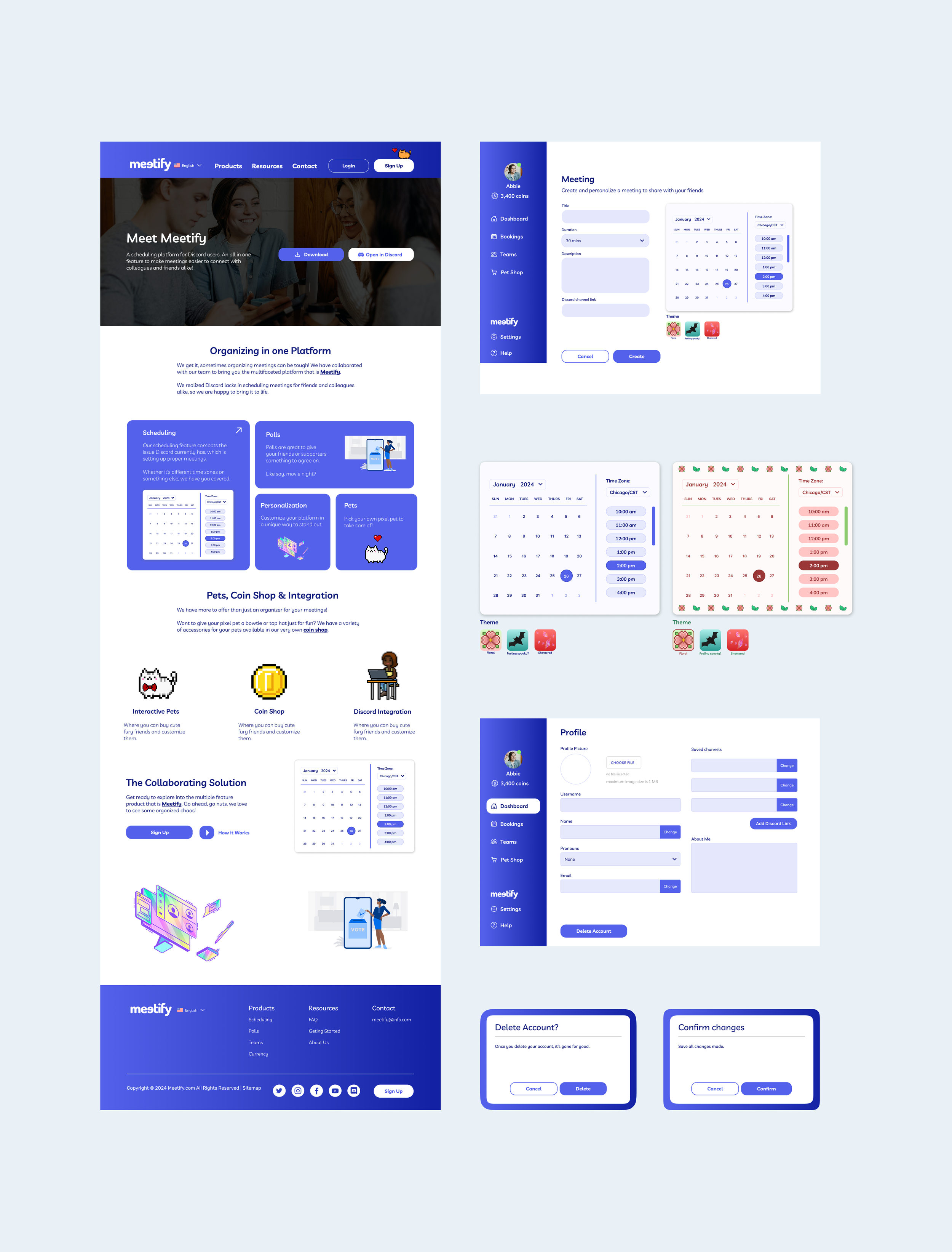
I was primarily in charge of creating the style guide for the product as well as the high fidelity mockups. Not only were we designing for the actual app, but the desktop design as well. Discord has a very distinct appearance to it, so I wanted to keep the theme as accurate as possible when representing our product. This included the imagery, typography to the interactive elements.

Creating the Hi-Fi Desktop Mockups & App
As I finished the style guide for the product, I then began to create the main desktop pages that consisted of: Homepage, Products, Resources, Contact, as well as the Login and Sign Up designs.
For the app we wanted to keep the navigation simple: Dashboard, Bookings, Teams, Pet Shop, Help, etc. I came in later to help organize elements on the screen and aid our team lead with whatever she needed.
During all of this Felisha aided me on style, design, and informational architecture choices. I also aided her in designing the pages for the app mockups as well.

Optimizing Designs
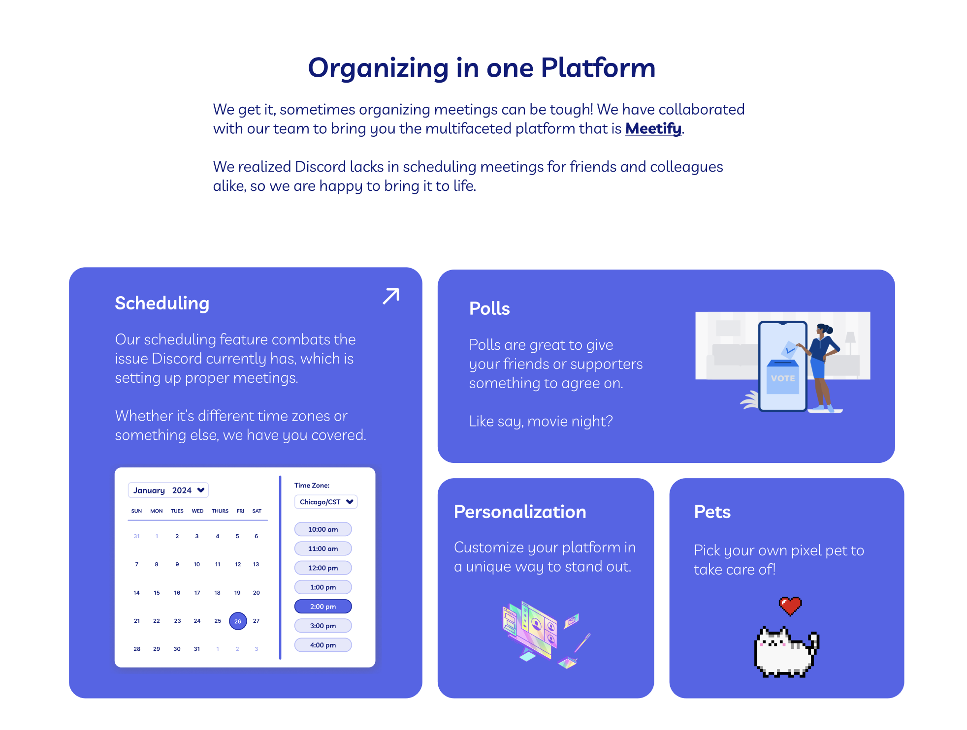
At first I designed the informative tabs in the beginning of the homepage, only to realize the design felt a bit dated and clunky. As a designer, it’s important to always ask other team members for advice when you get tunnel vision.
Before Iteration —>

<— After Iteration
A team member referred to the bento box design and I began to do my research. This design is not only sleek and functional, but showcases the design and information seamlessly while using the right amount of space.

Adding Some Flair
To give our product some flair; something to make it our own in terms of uniqueness, our Lead Designer Felisha beautifully put together the pixel art throughout. We added a pet store option to keep the users engaged and curious.
We used the carousel in a lot of our designs since it was easy to navigate the information on screen.

Designing While Prototyping
It’s a good rule of thumb to design properly within dimensions, elements, and whitespace while in the prototyping settings for the device you are designing for.
I noticed how spaced out my elements were instead of being right in the focus of the page.


Mistakes = Human
Even with the years of experience in my field, sometimes I get carried away into designing for a product.
Sometimes coming back to your design a few days later, while also getting advice from your teammates, can really make a difference.
At the end of the day, we all have potential to be designers.

Final Thoughts
Overall I was honored to be apart of this project and to create something functional and meaningful for my portfolio. I want to give a big shout out to the design team lead Feisha, who really helped me throughout the entire project and whom I learned so much from. If it wasn’t for our dedication I don’t think this project would look as nice as it does.
Working on this project showed my resilience to finish something that I started, and to always learn and grow despite issues that may arise.
