

Try Low Waste Case Study
Timeline - July-November 2021
My Role - Solo student project for Springboard UX/UI Bootcamp
Navigation
Process Interviews Testing Methods Design Prototype Thoughts
The Problem - Plastic packaging is the leading cause to damaging the environment
Our current culture of consumption is unsustainable. In a study in 2019, it was found that the world produces about 43 billion tons of CO2 a year (www.theworldcounts.com). I wanted to create a solution to this problem, that is by no means perfect, but gears to the right direction of reducing our emission footprint.
Challenges to Success
We want sustainability to be more of a focus than an afterthought. But searching for “low waste” on the web seems to be overloaded with information. I also wanted to create a tool to track carbon emissions to inform said user. This sparked my idea of creating a platform(s) that would allow someone to be more sustainable effortlessly.
Tools I Used

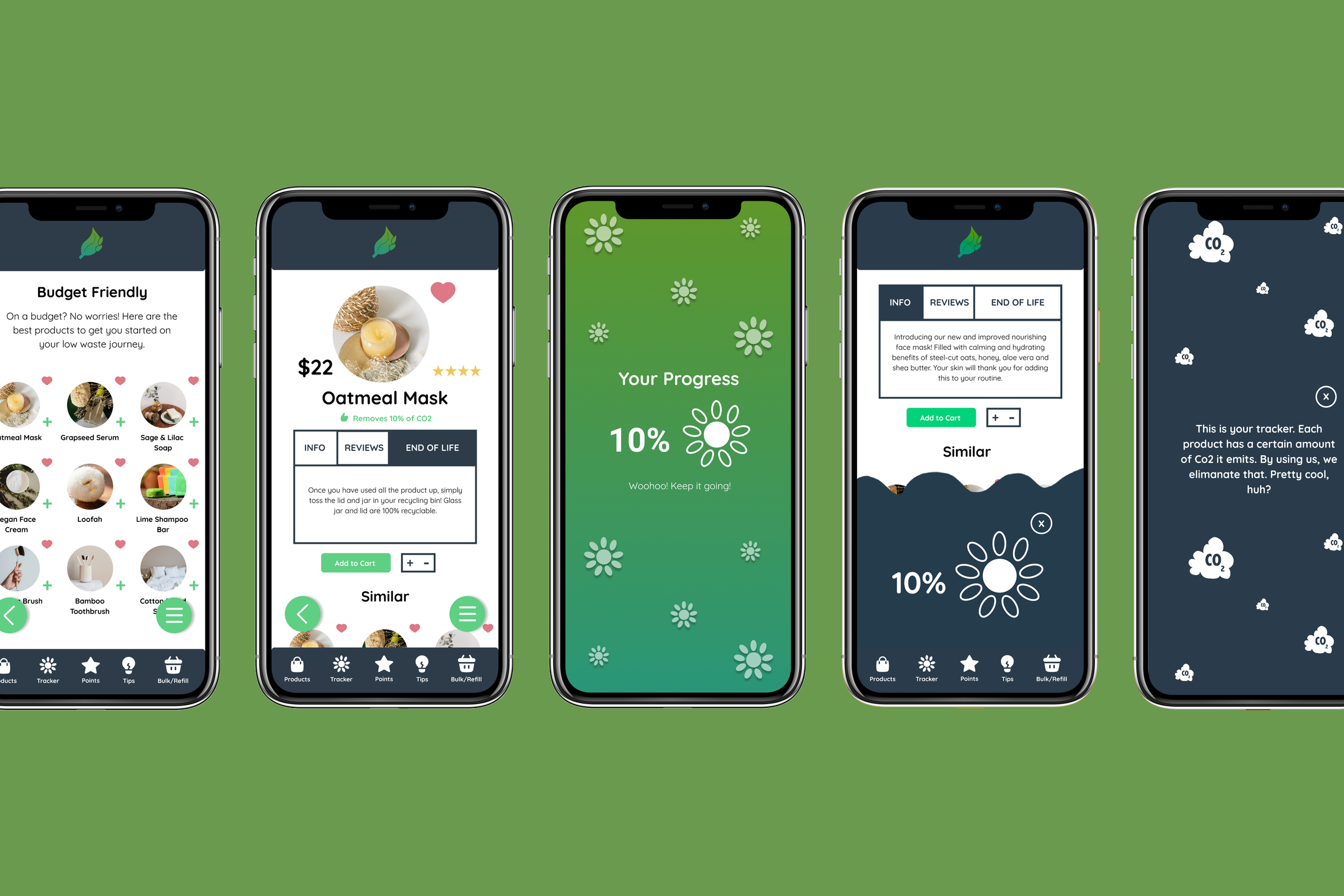
The Solution - Making low waste choices more accessible and easy to discover
The Process
Engaging Content
Tips and tricks with insightful articles to help beginners.
Bulk/Refill map feature that shows stores in the vicinity of the user’s location.
A community to support the user on their journey.
Discovering Companies
Allow the user to discover a wide range of companies catered to limiting product waste.
From everything to compostable based products to dental care.
Budget friendly products are a must too, since most zero waste products can be $$$.
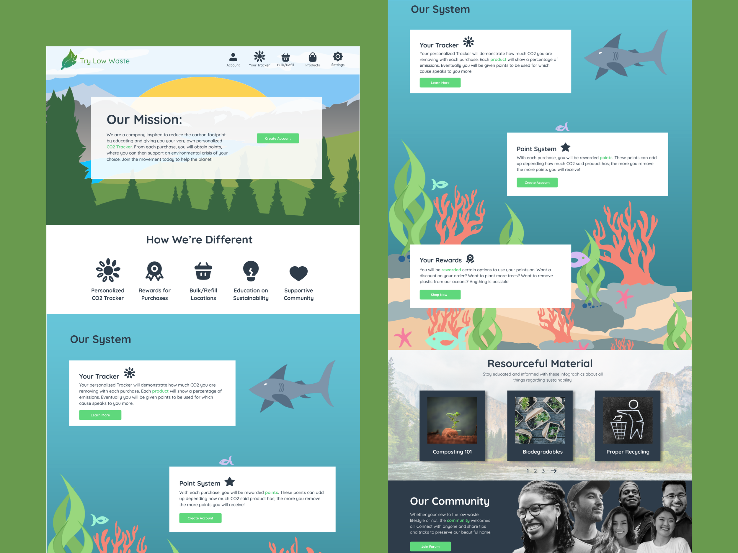
Rewards and Points
Rewarding engagement that keeps the user coming back.
Points implemented through each purchase to reduce waste.
CO2 Tracker that supports and shows emissions being eliminated with each transaction.
“We live in a consumer-based society. If something has too many steps for it to be sustainable, a lot of people will mentally check out and go back to their original habits.” - Participant A
Gathering Data from User Interviews
I wanted to create a product that would provide sustainability options for all incomes. Not only that, but I wanted to keep the user engaged, be allowed to track their carbon emissions, and understand each flow of the page(s) without being misled. So, I began to create my survey to receive feedback on how others have experienced low waste in their lives.
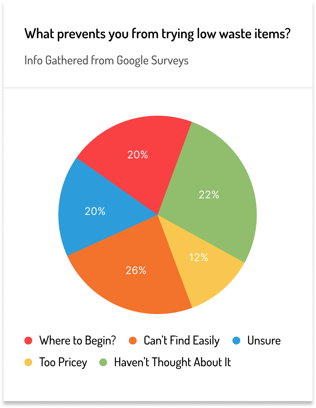
My Google Survey Results
First to understand how I would go about creating this product, I had to get feedback from multiple participants via interviewing in person and then compiling what I found in graph form.
Note not all results will be added due to format reasons.

Highlights Gathered from Interviews
Items can be costly.
“America is a consumer based country. So how can we make this better?”
Make the process easy and linear.
Visually pleasing designs (apps/websites) that make sense are a must.
Education is key.
“America is a throwaway society.”
Show users encouraging practices like less carbon emissions.
Maybe make a logo that tells the customer’s item is low waste friendly.
An overloading amount of information: “Where should I start?”
My Personas
With this information I then created my personas:
Major Insights from HMW, Edge Cases & Guerilla Usability Testing
With these 3 main research methods here is what I gathered more important insight to strengthen my project in all aspects. This process helped me define my routes and plan the best way to execute the next steps moving forward.

Budget-Friendly Options
How might we suggest low-waste items for everyone regardless of their income background?
To show Bulk/Refill options with reviews and pricing with the map feature.

Product Types
How might we showcase an environmentally friendly item, when a user is browsing online for one?
Sort products by material, impact on planet, CO2 input, etc.
Maybe make users want to achieve their 100% faster and rewards to buy said items.

Seamless Education
How might we use articles to educate users on how to practice a low-waste lifestyle?
How might we implement a community feature to strengthen the bond to not discourage them?
Conducting My Red Routes
From getting into the headspace of what my user would be looking for, I created 3 very important red routes for my product in Miro. They would be:
Tracking your emissions and reducing your footprint.
Popular products and stores that support refill stations.
Bulk locations near you.
MVP’s & Empathy Mapping
Based on the defined red routes that I created using Miro, I constructed a Minimum Viable Product. I then used my personas as a reference to construct the empathy mapping for my two characters.
What did they say?
How did they think?
What did they do and how did they feel?
Constructing this information is key to finding the pain points in your design to refine it.
Beginning the Design Process - The Storyboard
Designing for mobile was not my forte, and although it was exceedingly frustrating at times, it eventually created a rewarding experience to be had. I started out by manually drawing my red routes for desktop and mobile.
From Paper to Digital
I then brought my lo-fi fidelity mockups to life to get feedback on my design.
Resolving Issues
My first original mockups for mobile had a variety of issues I had to resolve. To redesigning the bottom navigation, to implement the Tracker. I used usability testing and interviews to find out what the major pain points were:
Created 2 bottom navs for the thumb to easily access.
Organized and simplified icons of interest with text descriptions.
Redesigned opening screen for beginning navigation.
Implemented Tracker popup.
Designed a more thumb friendly back button that correlated with the hover burger menu.
Going Above and Beyond
I decided to create my desktop illustrations for the mockups by hand (technically mouse) in Photoshop.
I try to not make things more difficult for myself, but I ended up sketching the shapes using the lasso tool and then finally filling in each shape respectfully. I looked at various nature pictures, along with animals, to get a feel for each color palette. I was always in awe and inspired by other illustrators when looking for design inspiration on the web, so I wanted to try it out myself.
Yes this process took a bit of time, but in the end it was so worth it to create a beautiful product that meant so much to me.
The Final Product - Prototyping and Final Feedback
The final round of interviews from my prototypes, participants expressed how they enjoyed how informative and aesthetically pleasing the experience was.
I enjoyed immensely designing the illustrations by scratch to really create an immersive experience. It was also fun again to draw manually on paper, which brings me back to my childhood as a starting artist. Although designing on mobile was intimidating at first, I was pleased with how well I adapted to the challenge.
The Style Guide
Brand: As much as I enjoy color (who doesn’t?), I realized after that my project should speak for itself. I left colors like CTA’s, primary and background colors to a minimum. The action & text colors were the only ones I forwarded on, besides the hand drawn illustrations I would create later.
“I think what you’re doing is fantastic. It could really help people learn about reducing their waste and for more people to take the health of our planet more seriously.” — Participant B
My Final Thoughts
The 4 Important Takeaways I Learned:
Use colors to convey a strong meaning with design hierarchy, where points are clear and concise with surrounding information.
Learning the emotional patterns from my interviews when regarding low waste.
Don’t forget your original ideas.
Functionality over something just aesthetically pleasing.
The Conclusion and Takeaway:
What drove me to make this product was my passion for the environment. I personally practice low waste in my routine, and I noticed how there wasn’t an option for what I dreamed of implementing on any platform out there. For future projects to come, I want to create ideas that seem out of reach but possible at the end of the day. I really believe that my project, as well as creating the carbon emission Tracker, will really help individuals be more aware of their footprint for years to come. It will help guide children and adults to be more conscious of their impact on Earth.